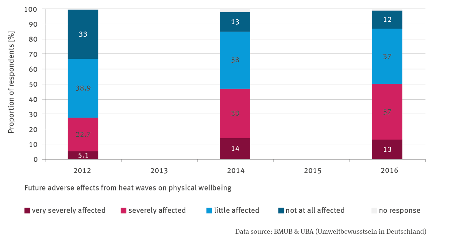
The stacked column graph shows population survey results for 2012, 2014 and 2016. The percentage of people who feel very strongly and strongly affected has increased, while the percentage of those who feel less or not at all affected has decreased. Both groups roughly balance each other out.
Source: BMU & UBA (Umweltbewusstsein in Deutschland)
Download image (102.15 kB)